Brief
A construction company approached us for the creation of their logo and corporate identity as well as their stationery.
We were asked to create something modern and original rather than something ordinary.
So, we chose to play with the letter “N” and depict a slope that is interwoven with the angles of architecture.
The client’s needs were:
- Logotype
- Stationery (cards, A4/DL envelope, Notepad A5 /A4)
- Exterior shop signs
- T-shirt
- Safety vest
Execution
The client was presented with these 5 logos.

The client’s final choice was this, and so we proceeded with testing a variation of colours for its final colour adaption.
We then presented four different colour options of the logo to the client.
The client’s final colour choice was turquoise, so we proceeded to prepare it in CMYK and RGB format.

Stationery
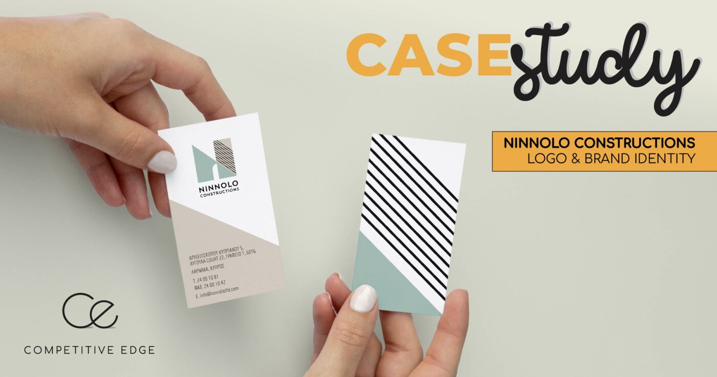
The design of the stationery material was based on the colours of the logo, emphasising the element of diagonal lines.
We then prepared the full range of stationery, together with the envelope and notepad.
Following the same pattern, the cards were also designed, completing the whole stationery in a coherent manner.

Along the way we created the signs of the store.
We suggested to the customer that the name should be written in large letters at the top and the logo should be placed on the window in the form of a sandblast.
We also prepared the email signature for them.
The sign which will be placed at each construction site of the company.

We also created the uniform for their employees (t-shirt & Safety vest).


